This week, I found myself thinking about how I actually discovered my edge in trading. It was not luck. It was not a hot tip. It was a process.
There were three clear steps.
First, I noticed something in the market that aligned with how I naturally think and trade. I was not trying to force myself into someone else’s strategy. I was watching behavior, volatility, and structure, and asking: where is the repeatability?
Second, I built a system around my observations. Not a guess. Not a narrative. A testable framework designed to anticipate the specific moves I wanted to capture. If it could not be measured or repeated, it did not belong.
Third, I translated that framework into actionable signals. A system is theory. Signals are execution.
That final step is where most traders stop short. Ideas do not make money; process does.
This may sound personal, but it is not. It is a blueprint.
An edge is simply the result of seeing something others overlook and building structure around it. The most successful investors are not guessing better. They are operating from a defined advantage. A proprietary system. A distinct lens. A disciplined method.
This framework creates distance between you and the average trader. And that distance is your advantage.
I will show you exactly how this process led me to develop an award-winning volatility indicator and why that structure still drives my results today.
The Big Issues With VIX
More than a decade ago, I began closely studying the Cboe Volatility Index (VIX).
VIX is a popular volatility indicator. It’s called the “fear index” because it rises as prices fall.
The chart below shows this relationship, with the VIX in blue and the S&P 500 ETF (SPY) in black.
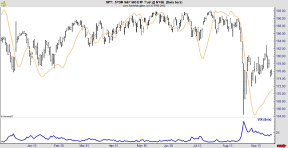
This chart shows the S&P 500 from back in 2015. VIX is at the bottom. You can see it moved higher as the SPDR S&P 500 ETF (SPY) fell in mid-August. It declined as SPY recovered.
Because of this, VIX looks like it’s useful. But that’s just it: VIX only looks like it’s useful.
The fact is, the VIX doesn’t show you anything you don’t already know. By the time it starts to spike, stocks are already falling. You can try to short stocks on a VIX spike, but it also doesn’t tell you if that fall is likely to continue.
That’s because of what the VIX actually is: the expectations of volatility in the S&P 500 over the next 30 days. When stock prices recover, expectations quickly reverse.
In short, it’s noisy. The relationship between VIX and stock prices isn’t clear. And I knew there had to be a better way to know when stocks were about to fall, and keep falling.
To fix that, I did a couple things.
First, I inverted the VIX. Now, VIX would fall along with stock prices instead of rise.
Next, I charted the moving average of the inverted VIX against stock prices. Now the VIX would fall before the S&P 500, and the signals would last longer than the original VIX.
The inverted, slowed-down VIX is the orange line in the chart, overlaid on the SPY price action in black. You can see how the orange line fell ahead of the August crash, even as prices were rising.
Now, the VIX was useful. But there was another problem I had to fix.
Taking the VIX Universal
VIX only applies to the S&P 500. If I wanted to trade more than SPY, I needed to keep tinkering with it. And I trade a lot more than SPY.
I noticed that the orange line I created looked a lot like the stochastics indicator, which is a tool that compares a security’s current price to its price range over time. Both lines oscillate from low to high values, showing overbought or oversold conditions.
Since I knew the stochastics formula just puts the current price in historical context, I started applying that formula to VIX.
With that, I essentially had a VIX that applied to any stock. After a few more tweaks, I developed a system for predicting the moves I was looking for.
Now I needed a way to generate timing signals.
That was the easy step. I simply added a moving average to my indicator.
The result is in the next chart.
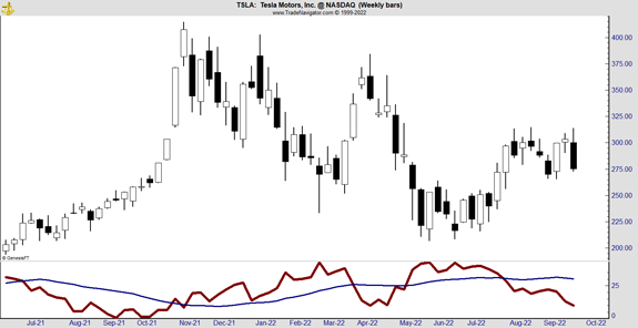
This system behaves much like the VIX. It rises when prices fall. When the indicator (red) crosses above its moving average (blue), that generates a sell signal. A break back below the moving average signals a buy.
The July 2021 buy signal and November 2021 sell signal in TSLA show how this structure plays out in real time. I realize using a 2021 chart may seem dated, but it remains one of the cleanest examples of how the setup works.
More importantly, this is not limited to a single historical example. Over the past 10 months, this put-selling framework has delivered a 100 percent win rate across varying market environments. It has not depended on ideal conditions. It has depended on structure.
Watching SpaceX This Week – Here's What They're Missing
Everyone's watching Elon Musk and SpaceX - but they're missing a secret opportunity that could add thousands to your monthly income. Elon won't say a word. But we will. Find out before the crowds rush in for the IPO, click here.