One of the best ways to spot opportunity in the market is by using charts, by using technical analysis for trading.
Granted, as we noted in an earlier article, some traders will tell you technical analysis for trading is nonsense:
- Warren Buffett once said: “I realized technical analysis didn’t work when I turned the charts upside down and didn’t get a different answer.”
- Peter Lynch quipped: “Charts are great for predicting the past.”
- And as Benjamin Graham explained: “In the short term the market is a voting machine, but in the long run it is a weighing machine.”

However, as we learned from Jesse Livermore, “The price pattern [we see in charts] reminds you that every movement of importance is but a repetition of similar price movements, that just as soon as you can familiarize yourself with the actions of the past, you will be able to anticipate and act correctly and profitably upon forthcoming movements.”
As Livermore points out, stocks, ETFs, and indices will often move in trends. In fact, we can look at three trends today that could help you the next time you’re looking at a stock chart.
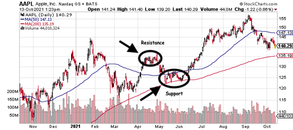
Support and Resistance
Each time a stock repeatedly tests a specific price without breaking down, we refer to that as support. Resistance is the opposite. Each time a stock tests a specific price overhead and continually fails, we refer to that as resistance.
Look at Apple (AAPL), for example.
Between May and June 2021, you can see that each time the AAPL stock pulled back to about $123, it caught strong support. Between July and August 2021, AAPL again found support around $145. But with regards to resistance, look at what happened to AAPL in April 2021. As hard as it tried to break through overhead resistance around $135, it couldn’t. Eventually, the stock pulled back because resistance was too strong.
Trend Lines
Another great way to spot opportunity is by drawing trend lines on charts. These help determine the strength or weakness of a current trend, or the overall direction of a stock price. Strong, powerful uptrends are made of higher highs. Weak downtrends can be characterized by lower lows. Until they reverse, the trend is your friend.
To return to Apple as our example: between April and October 2020, AAPL saw a series of higher highs and higher lows. Until the stock price broke below the trend line, the uptrend was still considered strong.

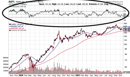
Relative Strength
Relative strength can help an investor determine if a stock is overbought or oversold, simply by using relative strength index (RSI) readings of between 30 and 70.
Let’s look at Apple again. Look at what happens when its RSI dips to or below its 30-line. The stock begins to pivot higher following a pullback. Alternatively, look at what happens when relative strength moves to or above its 70-line. Again, the stock will typically pivot in the other direction. While relative strength won’t predict pivots 100% of the time, it’s still a great indicator to watch.
Today, we covered just three essential chart patterns to be aware of, including support and resistance, trend lines, and relative strength.
Moving forward, we’ll discuss many more essential patterns to familiarize yourself with.